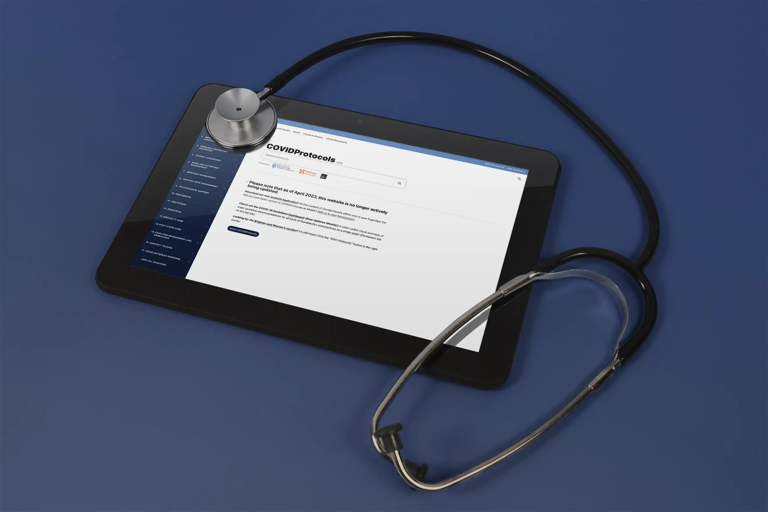
The Problem
Even though 2020 is fresh in our minds because it still feels like it was yesterday, allow me to set the stage a little. It's March, and it's a difficult time for those in the medical profession. The pandemic is growing and not only is there no vaccine or test, but there's not even a mask mandate yet, and the best practices for what to do are changing rapidly. More and more patients are coming into hospitals fearing that they have the coronavirus, with no real way to know, and the doctors need to be both as informed, and as calm, as they could be - not an easy feat, given the circumstances.
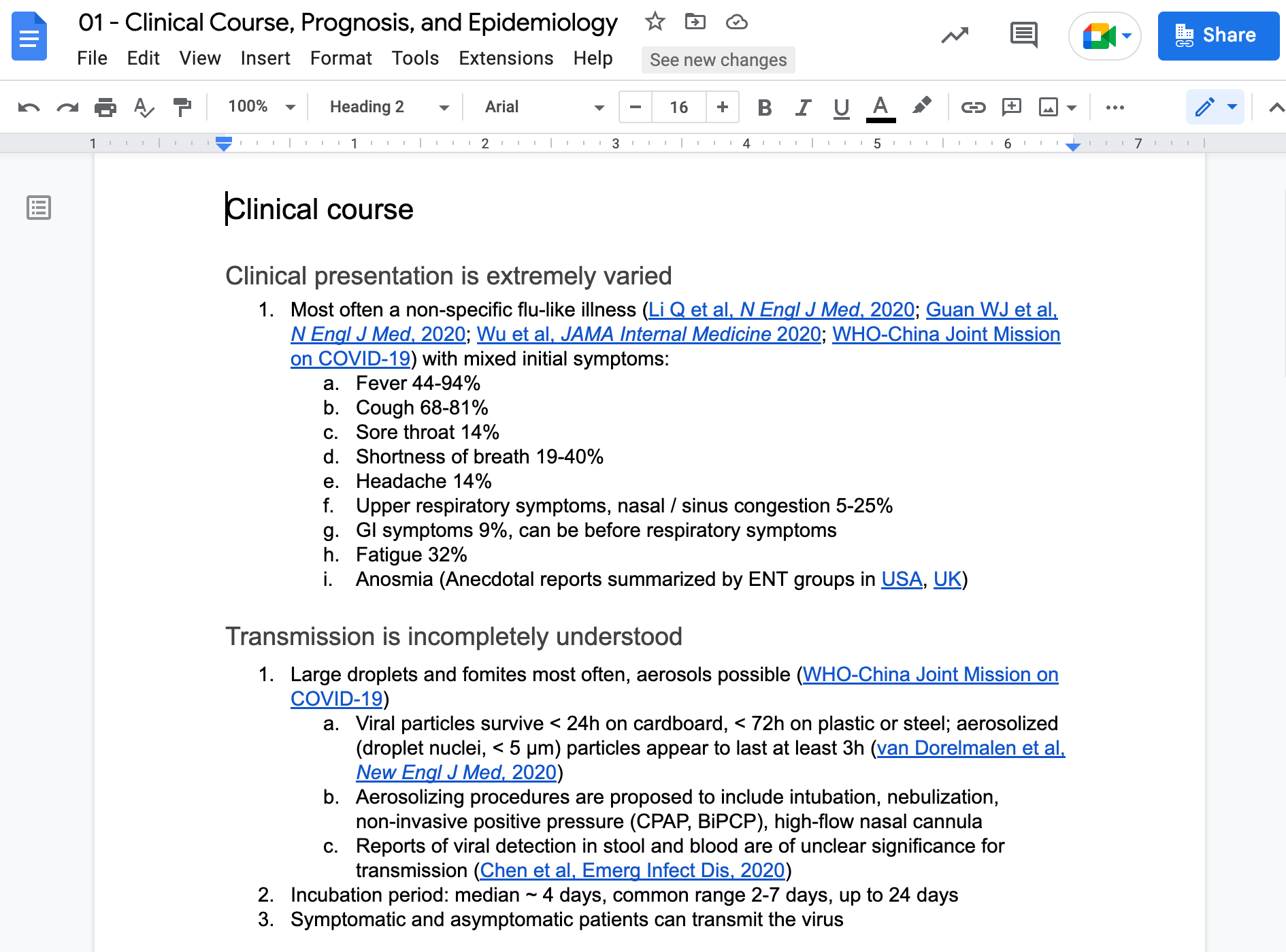
It was in this environment that Dr. C. Lee Cohen and a group of fellow doctors at Brigham and Women's Hospital in Boston began working to compile data in a Google Doc. This document would soon become a sprawling 16+mb file, with dozens of doctors collaborating to create a canonical source of truth for the latest information about the virus - not only for themselves, but for others. They would offer new information and discuss protocols in a true testament to teamwork. It was truly amazing to see.
They quickly ran into a few problems, however, as is bound to happen with something of this scope. These weren't the only problems, but they were the primary ones:
- Hospital Privacy: Some hospitals didn't allow Google Docs through their website blacklisting.
- Loading: Everything was extremely slow to load. The documents were growing to be hundreds of pages long with images and numerous comment threads and suggested edits. Getting it to work on hospital wifi was a chore.
- Mobile Optimization: Even at its best, Google Docs is not ideal for use on a mobile platform.
Research
My first step after learning the doctors' pain points was to look into different options for a real Content Management System. Upstatement was tech agnostic - we would use whatever made sense for the client, rather than forcing something upon them that didn't work for their needs. I ran through the ones that would normally be viable for something like this - WordPress, Craft CMS, Contentful, Ghost, the list went on, largely because the amount of content we were talking about was not actually an issue for a platform like one of those.
But they had other limitations because this was an extremely niche use case, and it became apparent quickly that no singular system could do everything we wanted out of the box. Things like having internal inline comments or changes requiring approval before going live, had mixed levels of support. But there was an even bigger obstacle than that looming.
Essentially, the doctors didn't want to use a different CMS. They liked the Google Docs experience and what's more, they understood it. It wasn't uncommon at Upstatement for me to train editors on the client team when we did launch a new CMS with them, and it was something I was always happy to do. But the sheer number of doctors made that not even remotely feasible. I could have recorded a walkthrough and explanation, but that still hinged on the idea that they would have the time to sit down and watch it and then play around and get comfortable - a huge barrier to entry even when there wasn't a global pandemic. I knew that wasn't going to happen. And people not using this defeated its entire purpose for existing. It felt like the wrong move could kill this thing.
With that new, important limitation in mind, I re-examined the problem and came to a conclusion. The problem wasn't actually "Google Docs isn't doing what we need", the problem was "If I'm just trying to look something up, there are obstacles". It was a matter of consuming the content as a user . Because really - for every doctor who was in there making updates, there were some dozen or so who just wanted to look something up, or read the latest updates. They didn't need the entire document, they didn't need the comment threads. They just needed the content to be accessible.
I knew that Google Docs had APIs that I could access the document data with, but it was still with some trepidation that I agreed to keep the editor workflow there. It felt like the best choice, but it was also not a CMS. Ordinarily I'd have had more time to experiment, but or obvious reasons this project was on a bit of a timer.
Experimentation
The new goal was quite clear, and also well within my team's wheelhouse: Find a way to improve the user experience. I will mention at this point that the team consisted of two other people - Nathan (the creative director) and Regis (the designer). I hadn't worked with Regis before, and while I wasn't a stranger to having to figure out the engineering side on my own, the stakes on this one felt a bit high for me on a personal level.
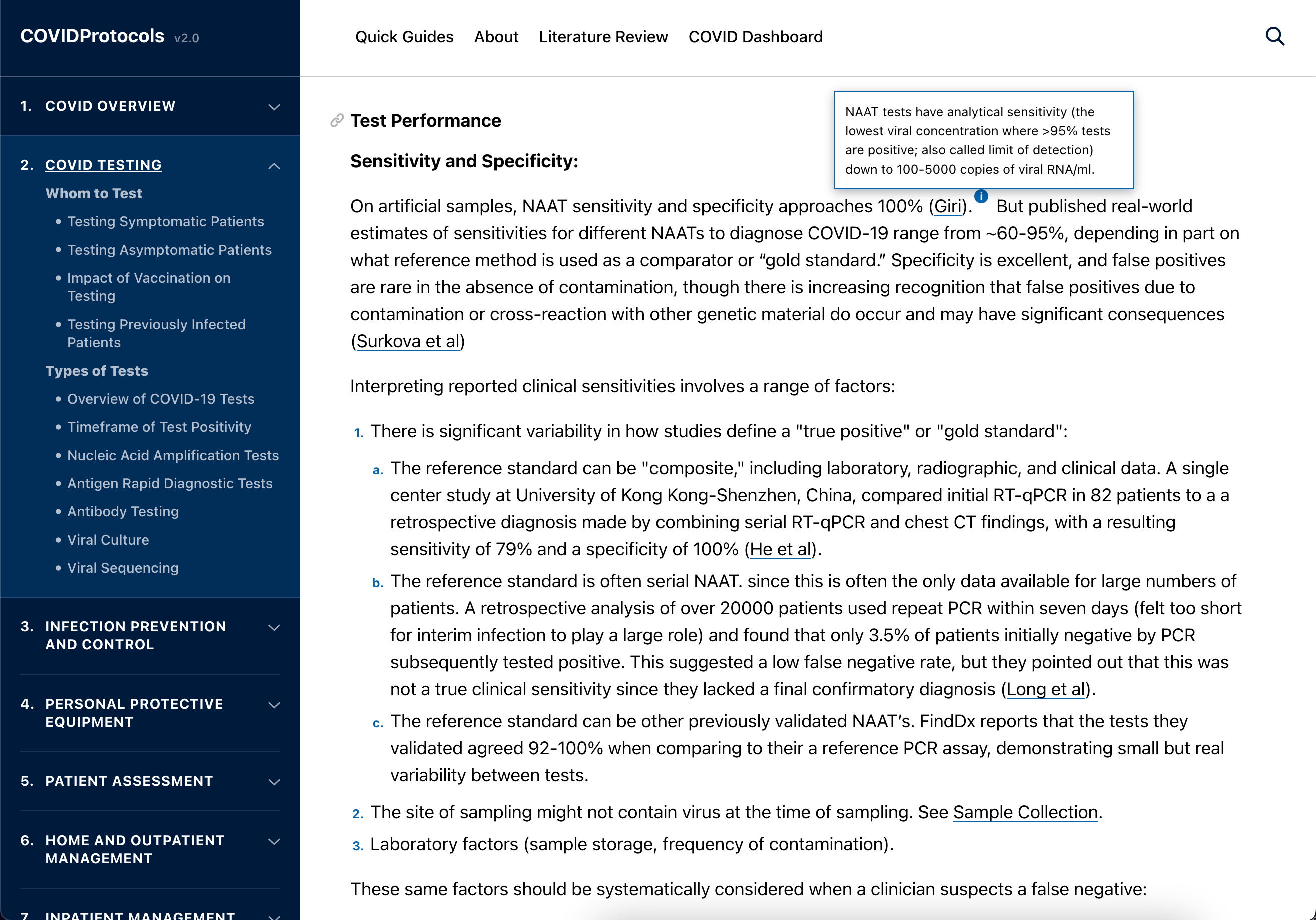
I'm going to drop a couple of screenshots early so you can see Regis's stellar work.
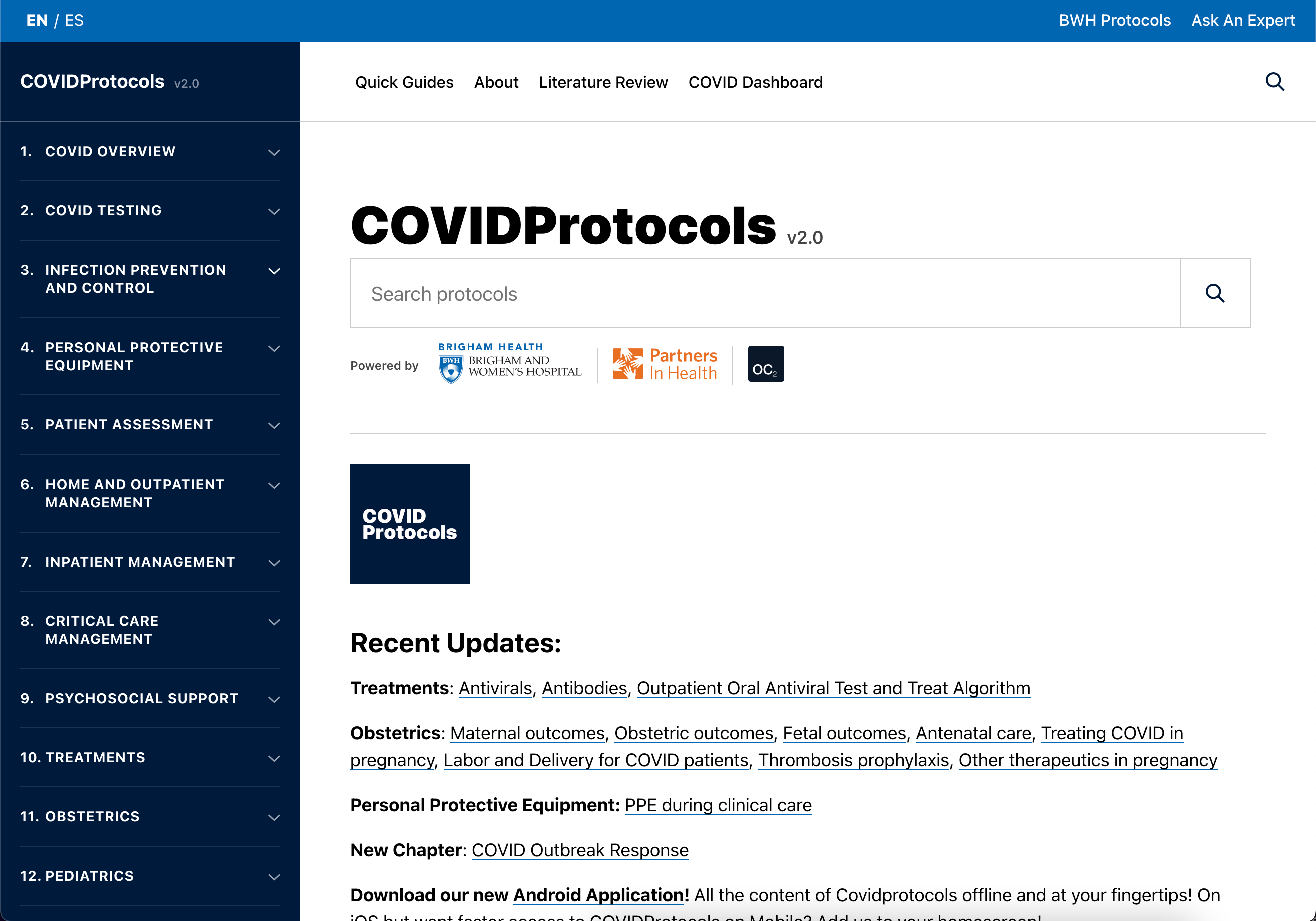
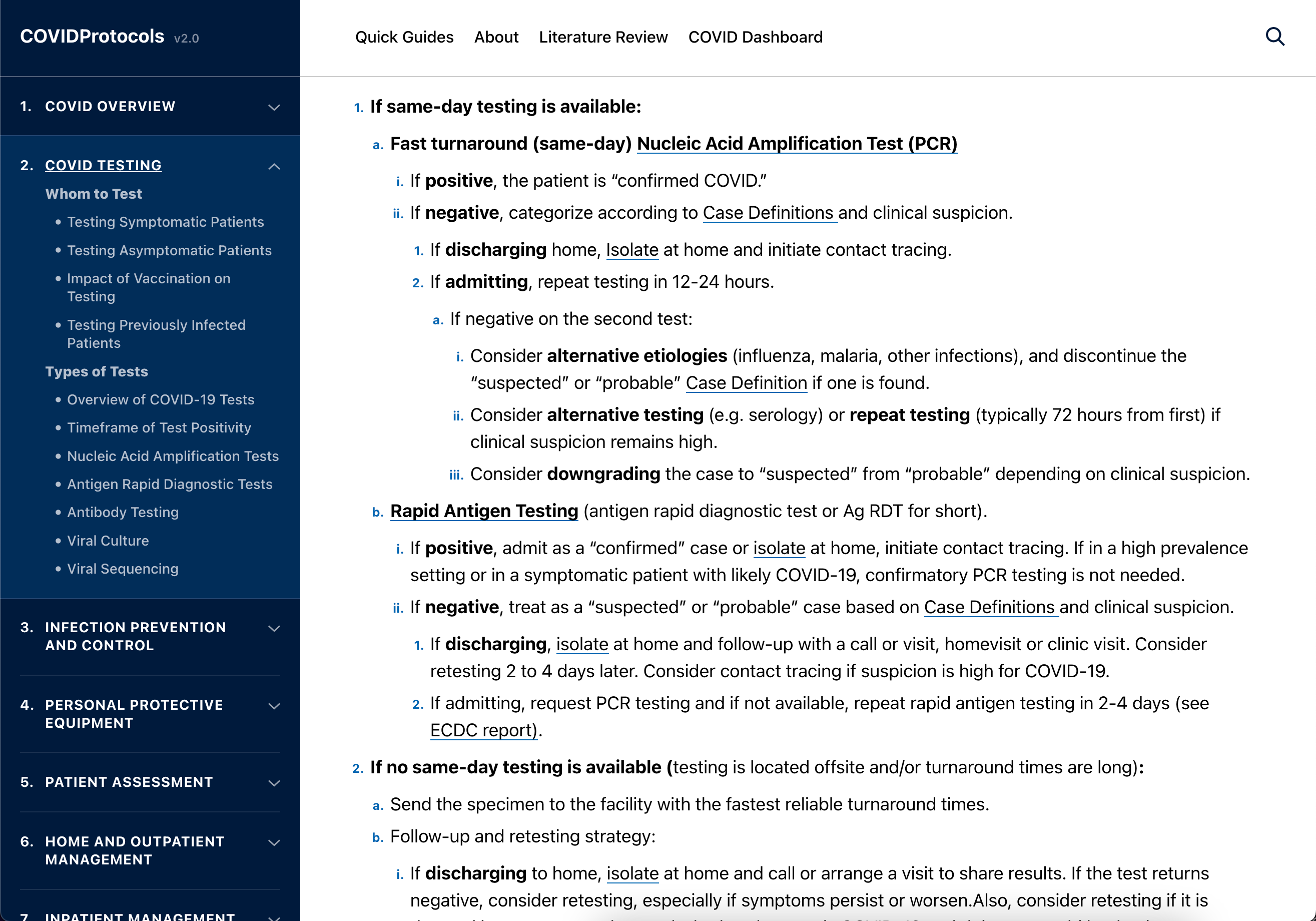
My next step was looking to see what already existed for using Google Docs in this way (spoiler alert: there wasn't much). But I did come across Library , put together by the New York Times. It used the Google API to access the data and build pages around that. Rudimentary in some ways, but very cool and promising.
Library fetched data live when you hit the page, which is interestingly enough something that we wanted to avoid - not only would fetching the live data from Google still be slow and run into same network problems, but with so many cooks in the kitchen, so to speak, we wanted changes and new content to be verified before any of it would go live.
I was already familiar with a static site generator called Gridsome . Gridsome's claim to fame was that it worked with any API - it would retrieve the data and use a GraphQL layer to dynamically create pages of content, and build a static site from those. I used it with Ghost.io before and have since also used it with Airtable and Craft CMS. (The previous incarnation of this portfolio even used it with static markdown files.)
But there wasn't a great parser plugin for Google Docs - and I didn't expect there to be one because this was such a unique use case. Leveraging a bit of the information on how Library had handled it, I wrote a new parser, making some improvements that were very specific for our case.
Solution
Some of what we wanted the parser to handle was simple, like adding
rel="noopener noreferrer"
and
target="_blank"
to all external links, or turning YouTube links into inline embeds. Some was slightly complex - like accounting for superscript and subscript because a lot of the content was scientific (achieved by checking the text's vertical alignment).
One of the more complicated things though was handling tooltips - something that certainly does not exist within Google Docs and isn't something we could easily add. So I opted to use something built-in that I knew they wouldn't be using anywhere else - any text that had Strikethru applied was treated as a tooltip, with an icon inserted directly before it.
I was also advising on content at this point. We knew there was a desire to support Spanish, and I'd long been the "go to" guy at Upstatement for handling localization, partially because of my past working at a language learning company, partially because I handled translation organization for my comic book, and partially because I'd already done other sites (like adding a Japanese microsite to Tito's Vodka )
One of the things that we started doing was breaking documents up into smaller files. Remember how I mentioned one of them being 16mb? We were hitting limits where the Google API would just fail to deliver content if the file was too large.
I recommended Netlify for hosting, as I often do with static sites (including this portfolio). For a time, we would manually deploy when something needed to be updated. Nathan would get texts and calls at all hours when there was an important update that needed to go out - everything was moving fast.
There were people on the BWH side who could have easily understood logging into Netlify and hitting the big Deploy button when they needed to make updates, but it felt like a bit of a barrier, and something that required a degree of institutional knowledge.
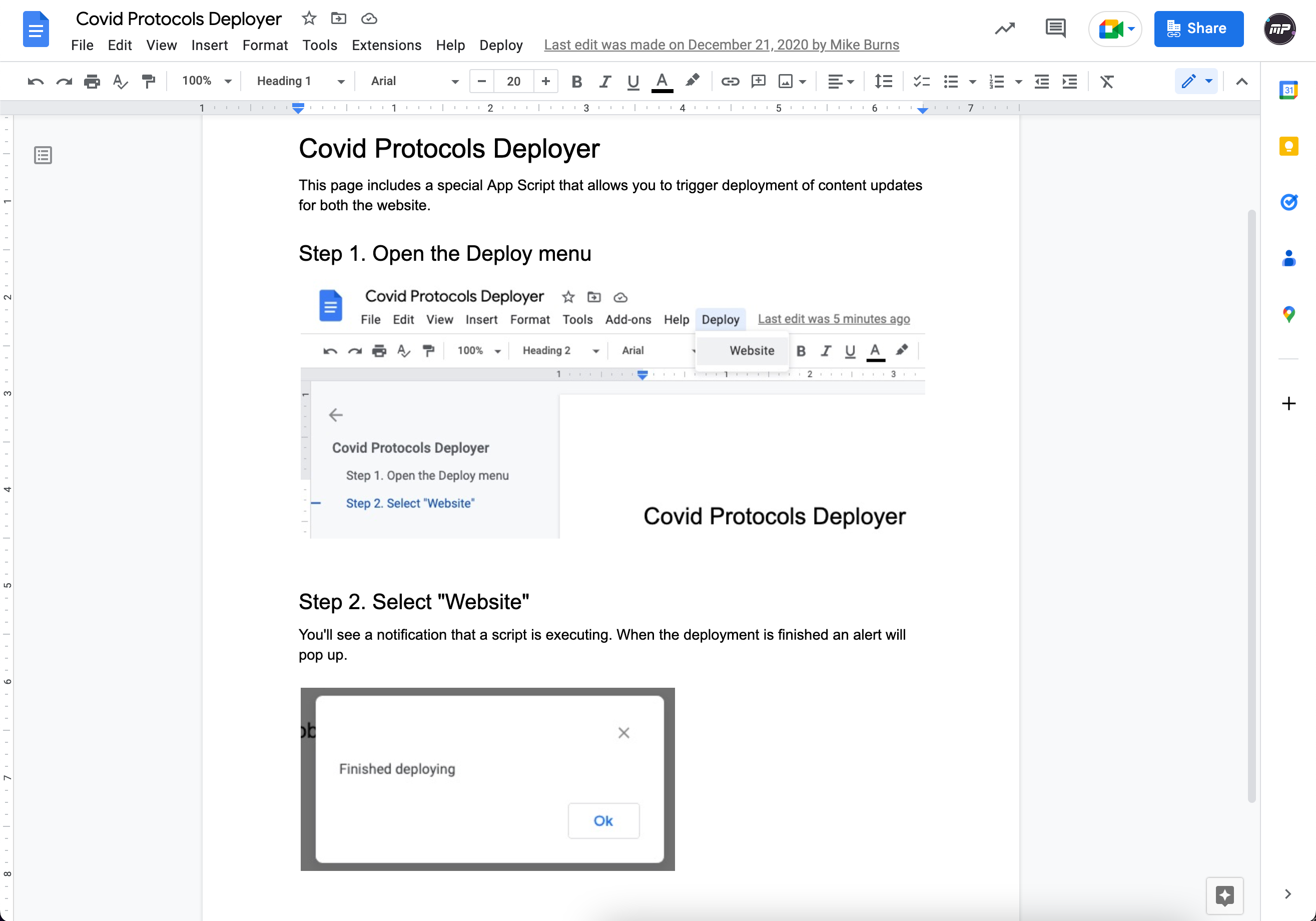
So in the main Google Drive folder, we created another Google Doc, one that would be ignored by the deploy system, and in this one, we added instructions and a custom app script where you could simply click a button to kick off the deployment process.
Future Deveopments & Lasting Impact
I came back a couple of times for a few more additions. There was talk of creating translations for Hindi and Arabic (and having the site support R-to-L ordered text) which I added support for (it turned out there wasn't enough demand to warrant translating all of the content - most of the doctors were already fluent in English). Another team at Upstatement would later create native mobile applications, further increasing the accessibility of the tool.
In May of 2021, We received an Honorable Mention in the Fast Company World-Changing Ideas Awards , specifically in the Pandemic Response category. Nathan and I were also interviewed by Liz and Casey from Scout, a student-led design organization as part of Northeastern University.
The highlight for me, though, has been receiving emails like this, as recently as late 2022.
Hi all, I’m Mark, a Chief Resident ... . During the peak of the pandemic in 2020 I was a daily visitor of the CovidProtocols website which served as a huge help to myself and my colleges during such a stressful time when ‘best practices’ were evolving so rapidly. I really appreciate the amazing work your team provided in helping BWH efficiently deliver and disseminate their content.”
For some closing personal notes, I think in tech we can often get caught up on the interesting problems and lose the human element. A lot of us don't have insight into the people who actually use what we make. Years ago at a UX conference, I heard a talk from Doug Deitz (which is now a Tedx Talk ) - it's all about user empathy and the importance of not losing sight of it, and it has always stuck with me. Even with my UX focus, I don't always get to know the end user. Working at Upstatement, our end user is often the client - the idea is that we help them build a new foundation that they can reach new heights with, and more often than not, I was in the business of empowering the editors . Not less important, but a different focus, and that was how this project actually begun before the pivot.
With this project, I (obviously) did not know how prevalent the coronavirus would be or for how long. I'd seen SARS and swine flu, 2012 and Y2K, and it was impossible for me to grasp the scope of what was coming. All of this is to say that, I'm a web developer and writer. I'm not one of these doctors. I'm not a therapist or firefighter. A lot of what I do is, in the grand scheme, not even remotely important. And I never, ever expected that I would have the privilege of working on something that may well have helped save lives. Calling it a privilege and an honor and one of the things I'm most proud of doesn't even begin to cover how much this project has meant to me.
